Celebrating Our Fifth Consecutive GovTech 100 Win
We are thrilled to announce that we have been named to the GovTech 100 list

A few weekends ago, across the U.S. and across the world, women marched and protested against the misogyny of Donald Trump. It comes as no surprise that, within the U.S., these marches sprung largely from urban counties and states that voted for Hillary Clinton. FiveThirtyEight has a great deep dive into the geopolitical distribution of the marches.
This article adds to their data collection and analysis in a graphical way, by applying data science techniques used commonly by martech companies for audience segmentation.
Demographics of the Women's March
Now, before politics, we want to set the stage with preliminary questions: what were some of the unifying demographic characteristics of the Women's March cities? What segments of the population were key contributors?
At LotaData, we used our proprietary datasets to find a clearer breakdown across socio-economic indicators of education, race and income.
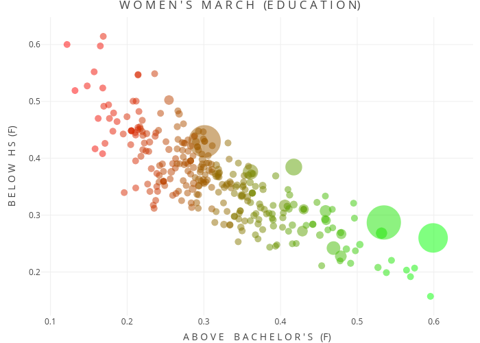
Education
Since this was, after all, the Women's March, we decided to focus on female educational levels and see how that may have affected march engagement. In the plot, the size of the bubble corresponds to crowd size.
What we see off the bat is that higher female educational levels corresponded with higher crowd numbers, though plenty of cities with lower female educational attainment showed up to march. There is a correlation, but it is not overwhelming.
Race
When looking at race, we decided to plot an indicator of city diversity combined with the percentage of Caucasian citizens. In this analysis, the diversity index is the probability that if 2 people meet randomly in a city, they will be of a different race & ethnicity.
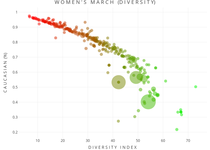
In broad strokes, the cities which are more diverse and less non-Hispanic Caucasian found higher crowd sizes.
Income
Economically, we looked at the unemployment rates, GINI coefficients and household incomes for the cities of interest. The normalized GINI coefficient applied to income is a measure of inequality. A higher coefficient indicates a more uneven distribution of income. A lower coefficient is closer to an equal spread.
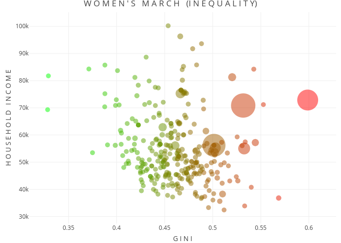
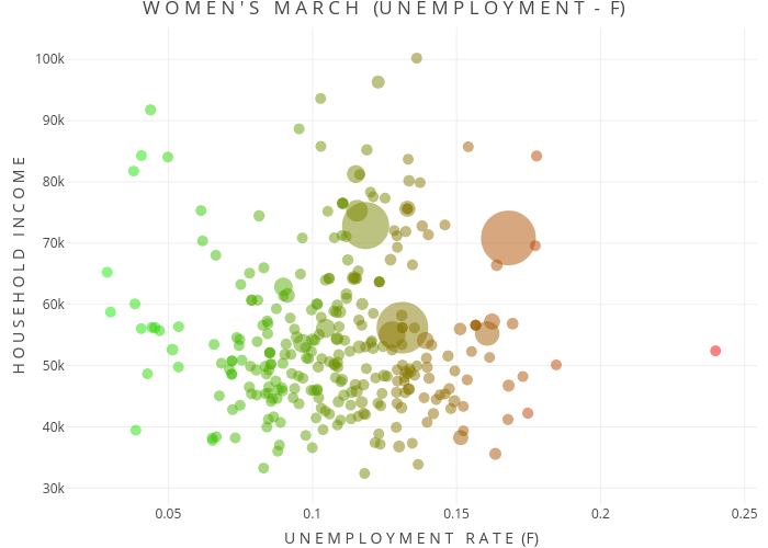
What we see is that in places with higher female unemployment, and places of high income inequality, women showed up to march in larger numbers.
Election 2016 Overview
Now, with the demographic stage set, we're going to make one main assumption to begin the political analysis. Namely, the political leaning of the county where a march took place is representative of the marchers. This won't be true across the board, but it works as a good enough proxy.
With this assumption, we begin by looking at how counties voted in the 2016 Presidential election. Each dot in the graph below represents one county. A dot is shaded from blue (Democrat) to red (Republican) depending on its political leaning in the 2016 vote. It is also either larger or smaller depending on how many votes were cast in that county.
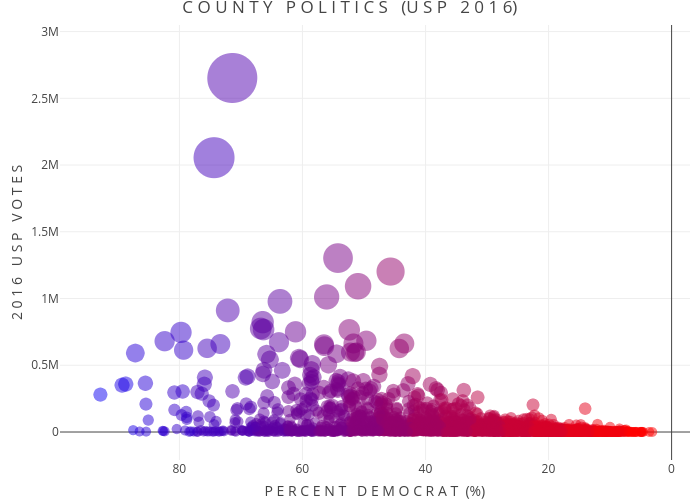
At a glance, we see larger counties (i.e. urban areas) went for Clinton and a substantial number of smaller counties (i.e. rural areas) went for Trump. If marches tend to take place in large cities or larger counties, we should already expect a leftward bias in the march regions.
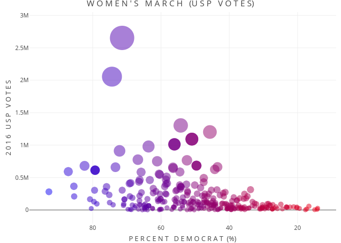
Cities of the Women's March
In this next graph, each dot now represents a city that hosted a Women's March, as confirmed by FiveThirtyEight. We mapped cities to their proper counties, so the political/voting information comes from the same data as before.
Comparing this graph to the first graph, we see that many of the large counties are represented here by large cities like LA and NYC, but most of the mountain of small counties is already missing.
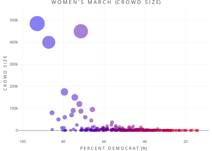
However, we don't just want to tie the election results together with the cities of the Women's March. We want to find out where most people were actually marching over the weekend. So we look at a graph of crowd size to clarify this.
Here we see that the biggest marches come in D.C., New York, LA, Boston, Chicago and Seattle. On the right side, we see that from ~50% Democrat to 0% Democrat, there really isn't much activity.
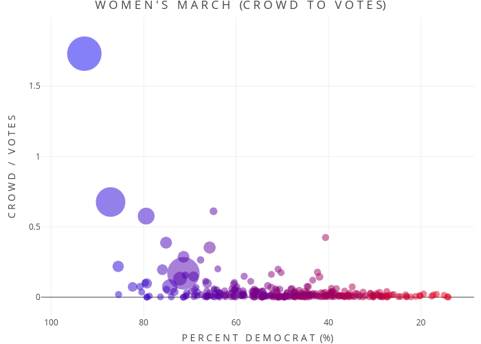
Perhaps that's the case because we're looking at absolute numbers here? After all, if there are only 1000 voters in a Republican county and all 1000 came to march, it wouldn't register on the graph.
We need to look instead at the proportion of crowd size to the number of people who voted in the election. This will give a sense of how many relevant people showed up to march.
After doing so, we see mostly the same story. Aside from the interesting purple-red point of Seneca Falls rising above the right (a noted Women's Rights landmark that likely saw a lot of out of town visitors), there is the same clear urban county influence.
Geography of the Women's March
As a last little plot, we were interested in visualizing the geographical breakdown of the marches. As seen below, the Women's March was heavily dominated by the coasts - not too much surprise there.
However, the march also had presence in many unexpected areas like North Dakota, Wyoming, rural Wisconsin and the Panhandle of Texas. As this election has revealed, the left needs to broaden its view and understand the needs of all American citizens. As both the Democratic and the Republican parties move to future elections, these unexpected spots of protest may be the right places to start building new coalitions.